How the number is built
You are going to sign a lease on one of these numbers. Here is every step it goes through.
How the count is assembled
Start with everybody in the age range and the sexes you picked. Cut that down by the share of households that clear your income bar. Cut it again for anything else you’ve added. What’s left is the count you see.
The map and the address report run that same definition through two different engines, which is a good way to end up with two different answers. So a test compares them and fails if they ever disagree. You should never be looking at a map that says one thing and a report that says another.
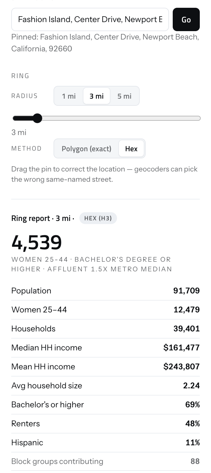
The report shows its working. The headline count sits above the population it came out of, the households, the income, and the number of block groups that were summed to get there, so anyone can take the number apart before they act on it.
What is counted and what is estimated
The census publishes age and sex together, so when you filter on those, the number is a straight count. It doesn’t publish education or homeownership broken out by age and sex at neighborhood level, so those get applied as a share instead. That assumes the trait sits evenly across the age range, and every filter using it is labeled so you can see which numbers rest on the assumption.
The income bar sits in that second category too, because it’s a household measure applied to a count of people, which is true of every model in this category and printed on the face of ours.
Resolution changes with zoom
Zoomed in, the map draws real census neighborhoods and the math is exact. Zoomed out, it has to lump them together before applying your income bar, and lumping changes the answer. At state-and-county zoom the average gap is about 2%, and the worst county we’ve measured is off by 39%. The map says so on the map when you’re looking at one of those views.
The address report is exact no matter what the map is doing, because it’s calculated fresh across every neighborhood the circle touches. It never reads the shapes drawn on screen.
Hexagons are weighted by population
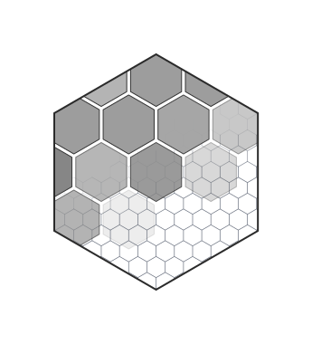
A hexagon usually straddles several neighborhoods, so we have to decide how much of each one belongs to it. We split by where people live, not by how much ground each one covers. That sounds like a detail and it isn’t: splitting by area puts about a third of the population in the wrong hexagon, with the typical cell off by more than 75%. It makes a map that looks right and is wrong.
The finest hexagons only exist where enough people live to support them. A rural county draws at a coarser size instead of pretending to a precision the data doesn’t have.
What we count as a competitor
We hold 16,160,293 places across the US, counted on 3 September 2026. What counts as a competitor gets decided when you ask, not when the data was built, so adding a category for a new line of work takes a config change instead of a rebuild.
Counting is per category and per place. A location that shows up twice in the same category counts once. Anything flagged permanently closed is dropped.
The honest limit: these are pins in an open dataset, not a verified list of businesses. Some have closed without anyone updating them, some are listed twice, some are filed under the wrong thing, and some are missing. IV hydration is undercounted worse than most. Read the number as a floor, not a census.
One thing we engineer against: if we have no coverage of an area, you get told so. A zero you could read as an empty market is the worst failure this data has.
Checked against another vendor
We compared our three-mile population against a major vendor’s number for 30 stores in one client’s markets. That is the only external check we have. One client, thirty stores, and not a general guarantee of accuracy.
The two tracked each other closely, which is the number most vendors would put on a slide. The more useful finding is that we came in low: 4.4% under on average, 5.2% under at the median, with 26 of the 30 stores below. If you are comparing our number against one you already have, expect ours to run slightly light.
We quote it that way because the flattering version of this stat is a correlation, and a correlation would have hidden the fact that we are systematically low.
Getting your customers onto the map
Most operators keep this in a booking or point-of-sale system and have never exported it. Onboarding is a person doing that work, not a form you fill in.
A customer record here is an ID and a ZIP code. Names, street addresses, emails and dates of birth have nowhere to land, so no setting can bring one across later.
The map, the rings and the competitor counts all run before any of it is connected. Your own customers sharpen the picture rather than switching it on.
Bring us the hard question
If something on this page looks wrong to you, that's a better first call than a demo.